I Like the Olympics But Don’t Write About Sports Too Much…Let’s Rate Some Olympic Outfits
I really enjoy watching the Olympics.
Whilst the Olympics can be fraught with controversy, there is something so enrapturing about watching others push themselves – and humankind's limits – to win the coveted gold medals.
What I really don’t enjoy however, is writing about sport. Why? Beats me. I like watching it, doing it and talking about it but words onto paper with sport? No way.
So, I decided to cover the Olympics using my own authorial flare and look at the fashion. Having viewed all 20 seasons of Project Runway: pre- and post-Heidi Klum and Tim Gunn, I am extremely qualified in fashion. Moreover, the Olympics’ opening ceremonies are known for many fashion hits and misses, Team Australia even more so. As the Opening Ceremony for Paris is one month away, let's take a blast from the past and get a rating.
Sydney 2000: 7/10 A Soft Slay
I quite like the Sydney uniforms overall. Considering the extra pressure to also design uniforms for volunteers and officials as it was a home Olympics, I feel like Team Australia successfully managed to design a uniform that reflected Aussie culture. I appreciate the relaxed look of the overall uniform especially the red jacket as an ‘almost blazer’ gives it a very youthful feel which was the aim of the uniform, as the average age of the team was 22!
The addition of the red is distinctive, and I like that it reflects the landscape of central Australia and compliments the deep green skirt well with that Southern Cross embroidery. This uniform also emphasised the use of ethically sourced Australian materials such as Merino wool which we stan.
My only qualm is with the shirt. While I like the golden yellow shade, I feel like they've just missed the mark with the addition of the plaid. It makes the uniform look slightly dated. Overall, it looks very comfortable to walk in and distinguishes itself well from the other uniforms.
Athens 2004: 6/10 Really Creative but also Sad Beige
I like the concept of the Athens Opening Ceremony uniforms. The fit is more relaxed, which reflects the celebratory nature of the opening, allows the athletes to be more comfortable in various weather conditions, and the uniforms can more easily be gender neutral which was ahead of the times.
I also enjoy the bomber jacket and the geometric star pattern; however I think the shade of green is too bright (almost fluorescent). If they made it in a richer tone with golden yellow detailing, the jacket would have been a winner.
Imagine a similar jacket today that rotates between local artists from, say, each state for each Olympics! A jacket rather than the current blazer allows for a lot more creativity in the uniforms which makes me love this uniform so much. However, I do have problems with the sad beige cargo pants as it makes the Olympic uniform less unique.
Beijing 2008: 4/10 It’s Blue? (Da Ba De)
Ah, the blue uniforms of Beijing. The Australian public hated these so much that Sportscraft (the manufacturer/designer of our Olympic uniforms) had to write a letter defending their designs.
Whilst I appreciate doing something different, I, like most people, feel that the omission of the green and gold eliminates what limited identity we have as a country. If there were more elements in the uniform that reflected Australian culture, say the addition of Aboriginal art with the permission of Elders or the addition of native flora and fauna in the design, the uniform might have been saved.
There were not many good photos of this uniform that I could find but from what I could tell the design on the jacket has very minimal or zero designs beyond the Australian emblem and the Southern Cross which further loses the Australian identity.
The general uniform itself keeps the jacket idea from Athens but has a matching blue gradient polo shirt that's made of activewear material which doesn't keep its shape or add anything to the overall uniform. The cargo skirt for the girls also looks too restrictive and heavy in comparison to the lightweight shirt.
London 2012: 5/10 Overcompensatingly Traditionalist (Boring)
London after Beijing was the transition back into the more formal uniforms, which I am not angry about as it emphasizes the prestige of the Olympics and allows the athletes to dress fancily in a career where you're stuck in activewear most of the time.
My issue with the uniform is that it's quite frankly boring with the white-on-white underlay. It also with its conservative-ness screams generic private school uniform. However after Beijing, Sportscraft started consulting with the athletes more which made them happier with this uniform than previous entries. As the athletes are the ones wearing it, I appreciate the further athlete input, even if I think it's boring.
Rio 2016: 9/10 Serves ‘Below Deck’ but Fashion
People either love or hate this uniform and I am very much in the love camp. I think that the coastal vibe was appropriate for Rio. I do agree with some of the criticism that Australian culture is a bit more casual and therefore the uniforms should be (such as the Sydney uniforms). However many of the athletes themselves actually enjoyed the ‘preppy vibe’ and the formality of the blazers.
This to me was one of the better uniforms in the new generation, post-Beijing, as it took the Olympic destination and put an Australian spin on it.
Also, this was the first uniform where the women had a skort rather than just a skirt (finally). And there are a lot of details that we didn't see such as the lining of the blazers having the names of every single Australian gold medalist, which I think is a fun piece of trivia.
Tokyo 2020: 7/10 Funky Triangles and Grey Blazers
This uniform would have scored higher than the Paris uniform if it was not for the weird sad greige blazer. I get that Tokyo is colder so there needs to be a blazer, but considering how minimalistic the uniform already was, having a plain grey blazer was not the move.
Outside of the blazer the geometric pattern is a welcome embellishment, which was said to be inspired by Shibuya Crossing in Tokyo. I also appreciate that female athletes were able to wear shorts both for media and during the ceremony or a relaxed dress rather than a restrictive skirt such as in London or Rio. I also think that the dark green bottoms were better than the white for practical reasons such as staining, see-through-ness, etc.
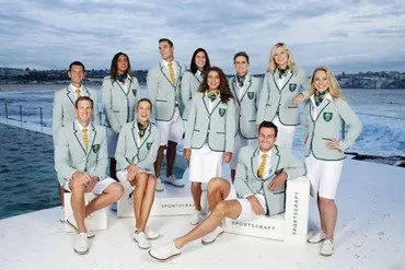
Paris 2024: 8/10 Solid but Missed Potential
The Paris Opening Ceremony uniforms are unique in a few ways. It’s the first opening/closing uniform to feature Aboriginal and Torres Strait Islander artwork on the scarves and pocket squares. The artwork is called ‘Walking Together’ by Olympic boxer Paul Fleming and artist David Bosun. Incorporating this art into the uniform adds another layer of cultural depth and allows athletes to add a personal touch in how they wear their scarves etc. which I really love.
Another detail is the ombre skirt which was described at the uniform reveal event as ‘inspired by a warm summer Parisian sunset’. Last time I checked sunsets *generally* aren’t green. Whilst I love the shape and the pleating of the skirt, the colours are just not it, especially with the same shade of green as the blazer.
Talking about the blazer, I get that the team has to have one, but the uniform is supposed to be ‘breathable’ (as the weather can get up to 40 degrees Celsius and the wait time for the ceremony is eight hours!) yet the blazer is still dark green, which would likely absorb a lot of heat.
Also, the beige chinos I just don’t like. Can I think of a better alternative? No. Do I think it gives uncle in a midlife crisis? Somewhat.
Overall though, a strong uniform however there was some missed potential especially in terms of inspiration from the host destination. Paris is known for its art, music and romantic scenery and I wish the uniform would incorporate more of that in an Australian context.
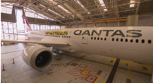
BONUS: This Year's Olympic Plane: 4/10 - An Attempt was Made
I love the attempt at the vintage font however this plane (respectfully) looks like it was made on Canva. The ombre starts and ends in weird spots, the writing is slightly too small and there is nothing else interesting or culturally significant on the plane. When I saw this plane it honestly made me feel somewhat sad. Whilst it’s aesthetically passable, it is no fun. Do better next time Australia.


